Role
UX Designer & Consultant
Timeline
March 2023
Industry
Events & Ticketing
Service
Website Redesign Proposal
VIPsocio is an events ticketing platform, marketplace and event-related services hub serving both event organizers and attendees. The website struggled with overwhelming navigation, poor information architecture (IA) and weak CTAs that failed to encourage exploration beyond ticket purchases.
Through a strategic redesign: simplifying categories, restructuring the referral flow and introducing event highlighters - guerrilla testing validated a 75% increase in post-purchase exploration, improved usability from 7.75/10 to 9.35/10 and 35% faster checkout.
While stakeholder buy-in was achieved for structural improvements, the visual design direction ultimately didn’t align with expectations for a modern aesthetic, preventing implementation.

Understanding the Challenge
VIPSocio had built a comprehensive website offering ticketing, event discovery, and related services for both event organizers and attendees. I met with the CEO and marketing lead to propose a design solution focused on the website's event section. Although we didn't reach an agreement to move forward with the proposed solution, this period served as a valuable experience of reflection and improvement through three strategic meetings.
Users were treating VIPSocio as a simple ticket vendor - purchasing tickets and immediately leaving without exploring the broader website capabilities. The business needed users to discover additional services, engage with multiple event categories, and possibly return to the website for future events.
According to the CEO, approximately 65% of visitors arrive through referral links, making this the primary user journey and the most critical flow to optimize.
The primary touchpoint for potential customers was through these referral links for buying tickets to specific events. Once they bought a ticket, they typically didn't explore other parts of the website.
Discovery Process
The first meeting ran for an hour where we discussed the site's problems, goals, and success criteria for a redesign. I recorded and transcribed the conversation, organizing insights into thematic categories for systematic analysis. This approach ensured I captured stakeholder priorities while identifying opportunities they may not have explicitly articulated.
Reported issues from the review notably included:
First-time guests weren't coming back, whether they found the site by accident or through referrals
Most visitors (about 65% according to the CEO) come to the platform through referrals. Once they buy a ticket, they typically don't explore other parts of the website
Certain organisers lack confidence in the VIPsocio platform
VIPsocio wants to appeal to a wider audience beyond urban events
Project Constraints
No access to site analytics, preventing a clear picture of user behavior patterns
Limited time frame and resources for recruiting actual users for testing
Limited ability to conduct extensive user research and recruit large sample sizes
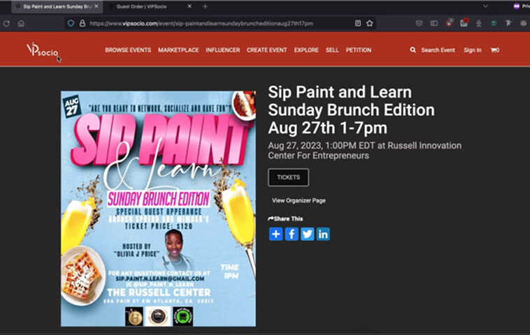
Referral links are the main way visitors come to the website and lead directly to the event details page. I obtained a free event ticket and went through the checkout process to map out the existing flow of purchasing a ticket.

The original referral flow showing where 65% of visitors were dropping off after ticket purchase, with no clear pathway to explore the platform further.
Ideally, analytics and surveys would've helped to get a better view of what's happening and possibly recruit the right users to get a clearer understanding of their experiences. Another option I considered was inviting new users to test the existing website and establish a benchmark for the redesign, but it would have been too time consuming with my tight schedule.
My best approach was to use existing research data to understand why people attend events. The articles and academic essays I found had similar central themes around networking, learning, socializing, and cultural experiences. This insight inspired a feature I called "event highlighters".

Research synthesis from multiple academic sources and event management studies revealing the primary motivations for event attendance, which informed the event highlighters feature
How might we attract and encourage visitors to explore our platform after buying tickets, build trust with event organizers, and appeal to a diverse audience?
Strategic approach
I deconstructed the problem statement into four interconnected parts, leveraging research data and inductive reasoning to generate ideas for each component. Some ideas were capable of solving multiple problems simultaneously:
Navigation Complexity: Streamlined category structure from 12 to 8
Information Overload: Improved visual hierarchy and white space
User Journey Fragmentation: Restructured referral flow and information architecture
Platform Stickiness: Enhanced CTAs and introduced event highlighters
After multiple checks and assessments, I reduced the event categories from twelve items to eight, introducing sub-categories for better refinement. This wasn't arbitrary reduction, | analyzed examples, existing event data, and content overlap to create logical groupings.

Category structure reduced from 12 to 8 main categories with organized sub-categories, while maintaining comprehensive event coverage
To address the overwhelming clutter and lack of white space, a restructure of the information architecture and flow was needed to minimize distractions and group related elements for better organization. The goal was creating clear visual breathing room while maintaining information density where it added value.

Ideation process of sorting through the proposed IA with paper sketches of possible visual solutions
The referral flow, used by 65% of visitors, required significant reworking. The main call-to-action (CTA) button after ticket purchase was a bland "Okay," with "Download ticket" as the secondary prompt - neither encouraged further platform exploration.
To encourage visitors to explore the platform, I revised the main button text to read "View other events" and made "Create an Account" the secondary option. The option to download tickets was moved to an embedded link within the feedback message, since tickets are emailed automatically after purchase.
These changes helped reduce the steps in the ticket buying process from 5 steps to 3 steps (or 4 steps for events with multiple ticket types).

Redesigned referral flow reducing steps from 5 to 3 and replacing the dead-end "Okay" CTA with exploration focused actions that encourage continued platform engagement.
Design Development
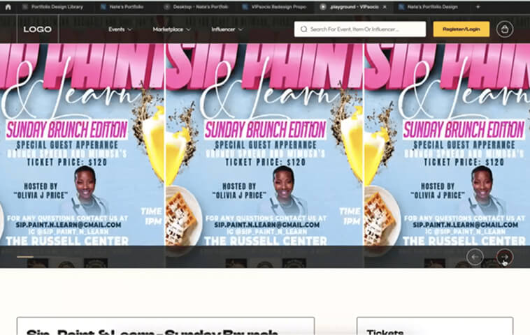
By examining stakeholder examples and curating designs from multiple sources, I developed paper sketches that evolved into wireframes visualizing the new design flow. Even though it wasn't fully complete at the time, I made just enough screens to prepare for the second meeting; prioritizing key user journeys that would demonstrate the redesign's strategic value.

High-fidelity wireframes demonstrating the improved information architecture, streamlined navigation, and placement of event highlighters.
The visual design direction became the 'make or break' moment of the design proposal. With the goal of understanding what was intended by the platform's color scheme, I explored evolving the platform color from is current "hue" to a more intentional "yellow-ish tone," demonstrating multiple variations to show flexibility.
In addition to my visual design goals, I wanted to highlight the necessity of a design system for the platform. I applied atomic design principles to build a library of styles and components that showcased how changing aesthetic essentials could be made easily during the final presentation.

Figma Design Library containing style guides and components, built using atomic design principles.
My research findings, which included data from experienced event managers, revealed that people attend events for specific reasons: networking opportunities, learning new skills, socializing with like-minded people, or experiencing cultural events. This insight inspired the "event highlighters" feature.
Event highlighters are visual badges that illuminate key event benefits, helping users quickly identify events matching their interests. For example, a networking event displays a "Connect with Professionals" highlighter, while a concert listing would display "Beyoncé Live" to highlight the artist draw. This allows users to scan event listings and immediately understand the value proposition without reading full descriptions.


Event highlighters feature (right) enabling users to quickly identify the value proposition of each event without reading full descriptions, addressing different attendance motivations.
Event highlighters feature (bottom) enabling users to quickly identify the value proposition of each event without reading full descriptions, addressing different attendance motivations.
This approach enables users to have sufficient information to quickly make decisions, ensuring they understand what value each event provides before clicking through to details.
Stakeholder Engagement & Validation
The second meeting was successful; I gained complete buy-in from stakeholders by walking them through my thinking process, presenting research data to support the proposed direction. The structural redesign successfully gained stakeholder approval. They understood how the simplified navigation, improved information architecture, and enhanced CTAs would drive the business goal of increased platform exploration.
To me, the best parts of this meeting were discussing how to track the progress and success of the proposed solution. That was quite an experience to see a potential end-to-end project with a process approach. The plan involved testing the new design with event organisers and users to gather feedback before implementing and gradually improving it.
Below is a preview of the proposed ticket buying process in comparison with the old, featuring updated CTA labels that prompt users to discover more of the platform.
Before: 5-step process with weak CTAs
After: 3-step process encouraging exploration
The existing events setup page had clutter and lacked structure, which might have made some organisers unsure about the platform. I restructured and redesigned the page to clearly highlight the platform's benefits, backing it up with data to build confidence for event creators.
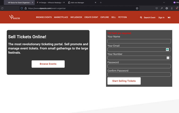
Before: Cluttered layout lacking structure
After: Clear benefits backed by data
I want to clarify that I'm by no means suggesting one shouldn't be expressive of their culture or heritage. However, the infusion of certain language and imagery throughout the platform seemed to create exclusivity that might limit the audience reach.
To appeal to a wider audience while maintaining authenticity, I simplified the language and incorporated more inclusive visuals featuring individuals from different ethnic backgrounds, ensuring the platform felt welcoming to all potential users.

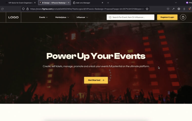
Landing and homepage design with inclusive imagery and language that appeals to a wider audience while maintaining cultural authenticity and warmth.
Despite implementation being stalled, I conducted guerrilla testing with 6 participants, presenting the existing design first to establish a baseline, then introducing the redesigned prototype. Participants completed tasks like finding events, purchasing tickets, and exploring the platform.
Increase in users exploring other sections of the platform after ticket purchase
Reduction in ticket purchase time on average
New design usability score (up from 7.75/10), ranking ease of use on a scale of 1 (very difficult) to 10 (very easy)
Improvement in task success rate for buying tickets
There was also engagement with the event highlighter feature, as participants made positive remarks about how it helped them quickly identify relevant events. The overall results were highly`` positive, indicating the significant impact the redesign could have had if implemented.
The final meeting didn't have the same impact as the previous two. I continued from where we left off, walking stakeholders through my thought process and presenting data to support my proposed visual design direction. I demonstrated the flexibility of the design system by showing how certain aspect, like reverting to the original color scheme, could be easily adjusted based on stakeholders preferences.
Unfortunately, the visual redesign wasn't considered modern enough to proceed. The project ultimately didn't move forward with implementation, despite the strong validation from user testing.
Reflection & Growth
In retrospect, this redesign proposal represents a journey marked by resilience and continuous learning. Acknowledging that outcomes can be victories or valuable lessons, I recognize several areas where a different approach could have prevented the implementation barrier.
Earlier Visual Alignment
Rather than presenting wireframes in meeting 2 and visual design in meeting 3, I should have introduced 2-3 visual direction options (mood boards) in the second meeting alongside wireframes. This would have allowed stakeholders to choose an aesthetic direction early, preventing late-stage misalignment.
Validating Beyond Structure
Testing both the old and new visual designs with users earlier would’ve provided data to support aesthetic decisions. Even simple preference tests with 5-6 users could have validated the design direction or surfaced the mismatch earlier, giving me leverage to either adjust the design or advocate for the proposed direction with user data.
The project served as a valuable experience for refining my decision-making and critical thinking skills. Navigating tight deadlines with limited information unveiled insights into effective prioritization; knowing when to focus on structural improvements versus aesthetic refinement, and understanding the importance of aligning both throughout the entire process.
Ultimately, this experience reinforced the pivotal role of research, iterative design, and usability testing in driving impactful improvements. It also highlighted that successful projects require alignment on both functional and aesthetic dimensions throughout the process-not just at the end.
While the redesign wasn't implemented, the validated improvements demonstrated the value of strategic UX decisions backed by testing. I've since applied the lessons about early visual alignment and continuous stakeholder calibration to subsequent projects, ensuring both functional and aesthetic alignment from the start. Research validates opportunities, testing proves solutions, and continuous alignment at every stage ensures implementation success.