Speso is a fintech platform serving Ghana and Nigeria, offering peer-to-peer payments, bill management, and money transfer features. I was brought in as Visual Designer to complete remaining mobile app screens for their growing product (v1). However, I quickly identified a critical bottleneck: the absence of a design library was causing visual inconsistencies and slowing delivery in a fast-paced startup environment. Taking the initiative, I conducted a Ul audit while simultaneously delivering required screens, presented my findings to stakeholders, and gained buy-in to build a pragmatic component library. The result: 2x faster design execution, visual consistency across features, and successful delivery of app store and social media launch assets.

I was brought in to execute - complete the remaining visual design screens for Speso's mobile app. The company was scaling rapidly, adding features like bill splitting, airtime purchases, and payment requests to serve their growing user base.
But as I began work, I quickly realized why the team was moving slower than desired: there was no design library. Colors varied across screens, spacing was inconsistent, and every component was being recreated from scratch. In a fast-paced startup environment with pressure to ship quickly, this approach was unsustainable.
Visual Inconsistencies: Different designers and iterations had created a fragmented Ul with no single source of truth for colors, typography, or component patterns.
Slow Execution: Without reusable components, every screen required building elements from scratch, significantly extending design timelines.
The Pressure Paradox: The team needed to move faster, but the lack of foundational systems was the very thing slowing us down.
This put me in a dilemma: I was hired to deliver screens quickly, but I could see that without addressing the root cause, we'd never achieve the velocity the business needed.
Rather than simply flagging the issue and moving on, I decided to take action. I proposed a parallel approach: continue delivering required screens while simultaneously conducting a Ul audit to build the case for a component library.
Working through existing Figma files during off-hours and between screen deliveries, I systematically documented:
Color Inconsistencies: Multiple shades of the same brand colors being used interchangeably
Spacing variations: Different padding and margin values applied arbitrarily across similar components
Component fragmentation: The same Ul patterns designed multiple times with slight variations
Typography inconsistencies: Varying font sizes, weights, and line heights for the same text hierarchy levels
Once I had concrete data, I presented my findings to key stakeholders. Rather than proposing an idealized, heavily-documented design system that would take weeks to build, I made a practical case:
“We don't need a perfect design system. We need a pragmatic component library - just enough structure to maintain consistency and accelerate our work without compromising delivery timelines."
The stakeholders agreed. I had buy-in to build what Speso actually needed.
With approval secured, I implemented a pragmatic, constraint-driven approach to establishing design consistency.
I focused on creating a functional component library rather than comprehensive design system documentation. The library included:
Core components: Buttons, input fields, cards, navigation elements
Color styles: Consolidated brand colors with clear naming conventions
Typography scale: The same Ul patterns designed multiple times with slight variations
Spacing system: Defined padding and margin values to ensure visual rhythm
Brief component descriptions: Short text explaining usage context

The component library focused on practical reusability, enabling designers to assemble screens from established patterns while maintaining visual coherence.
To move even faster, I implemented a simple process: sketch on paper before designing in Figma. This allowed me to iterate quickly on layout concepts without the friction of digital tools, validate ideas with stakeholders in low-fidelity before high-fidelity investment, reduce rework by catching issues early when changes were cheap, and maintain momentum by making decisions faster.
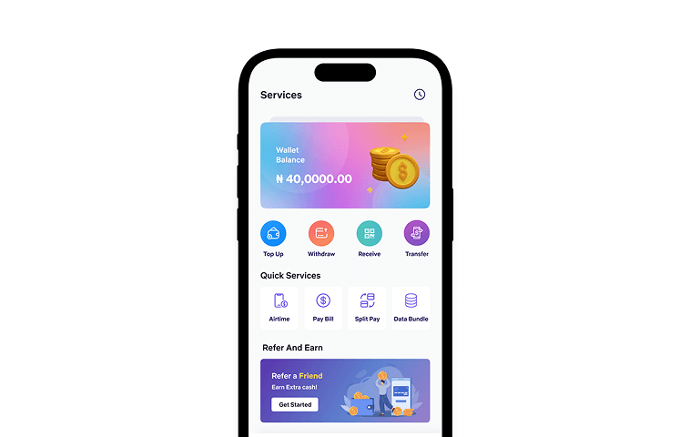
The component library enabled consistent, rapid implementation across Speso's key features. Rather than recreating Ul elements for each new flow, I could assemble screens from established patterns while maintaining visual coherence. The library's impact was visible across the product, as seen in the consistent feature design:
Bill Splitting
Users could divide expenses among friends with a clean, intuitive interface that matched the rest of the app's visual language.

Payment Requests
Business owners could request payments from clients through flows that felt cohesive with the overall experience.

Money Transfers & Bill Payments
Core fintech functionality maintained visual consistency even as features were rapidly developed and iterated.

Beyond the component library and mobile app screens, I created the inital marketing materials needed to launch Speso's presence on major platforms.
App Store Assets
I designed preview assets for both the Apple App Store and Google Play Store, showcasing key features and use cases to drive downloads and conversions.

Social Media Materials
To support the launch campaign, I created social media assets that aligned with the app's visual language, ensuring cohesive brand presentation across digital touchpoints.

As I built the component library and observed how it was being applied across features, I began identifying opportunities where the system could further improve user experience. While continuing to deliver required screens, I explored how the library's consistent patterns could enhance some of Speso's core interactions. I prototyped redesigned versions of key screens, demonstrating how the component system could create a more cohesive, intuitive experience going beyond surface-level polish to show how systematic design thinking could improve information hierarchy, reduce cognitive load, and create clearer user pathways through critical flows.
The redesign concepts validated the component library's flexibility and demonstrated its potential beyond immediate implementation. Rather than just accelerating execution, the library could serve as a foundation for elevated product quality, enabling designers to focus on experience improvements instead of reinventing basic Ul patterns.
While these redesigns weren't implemented during my time with Speso, the exercise reinforced the value of the foundational work: a robust component library doesn't just make teams faster; it makes better design possible.
Original Design Implementation
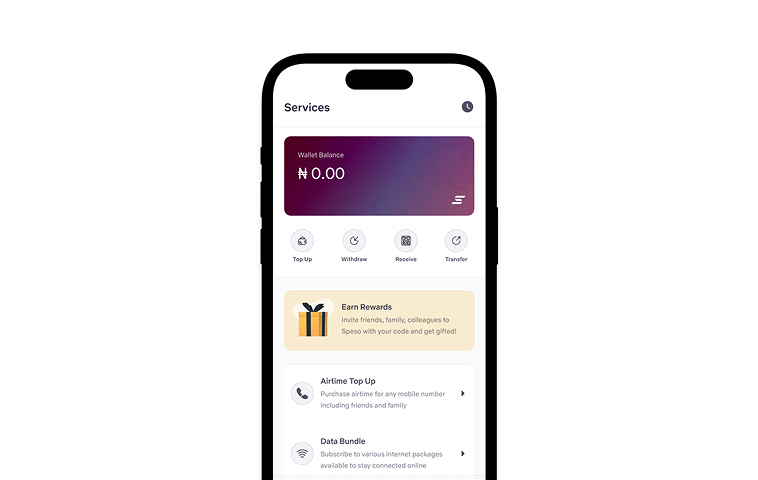
Redesign concept leveraging the component library for improved consistency and hierarchy
The combination of the component library, streamlined workflow, and parallel execution strategy delivered measurable results.
Faster design execution. By building reusable components, design velocity doubled. Screens that previously took days to design could now be assembled in hours, dramatically accelerating delivery timelines.
The parallel approach meant that building the component library never became an excuse for missing deadlines. I delivered both the required screens and the foundational system simultaneously.
The library provided a starting point for future designers and features. While not comprehensive, it gave the team enough structure to maintain consistency without constant oversight or rework.
Taking Initiative Paid Off: Rather than just executing assigned tasks, identifying and solving the root problem created far more value for the business.
Pragmatism Over Perfection: Our library had minimal documentation, but it worked because it matched the team's needs and pace. Sometimes the best system is the one that actually gets built and used.
Parallel Execution: Building the library while delivering screens proved that system-building doesn't have to slow down product work.
This project taught me valuable lessons about design systems, initiative, and working within constraints:
Stakeholder Buy-In Requires Evidence
Presenting concrete examples of inconsistencies and inefficiencies was far more persuasive than theoretical arguments about design system benefits.
Design Systems Don't Need to Be Perfect to Be Effective
A pragmatic, functional system delivers more value than an idealized system that never gets completed.